Showing posts with label interiors. Show all posts

Friday, May 4, 2012

Design Crush : Nendo

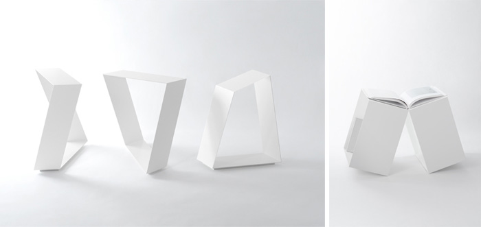
Nendo is just the kind of design firm that I imagine must be loads of fun to work in. A combination of high productivity, creativity, simplicity, curiosity, and humor - all things that should be on any good designer's checklist.
Their mission statement speaks for itself:


     Giving people a small " ! " moment.
    There are so many small " ! " moments hidden in our everyday.

    But we don’t recognize them.
    and even when we do recognize them,we tend to unconsciously reset our
    minds and forget what we’ve seen.

    But we believe these small " ! " moments are what make our days so
    interesting, so rich.

    That’s why we want to reconstitute the everyday by collecting and
    reshaping them into something that’s easy to understand.

    We’d like the people who’ve encountered nendo’s designs to feel these
    small " ! " moments intuitively.

    That’s nendo’s job. 


And a well-done job it is turning out to be. Besides capturing those amusing " ! " moments, Nendo is also taking advantage of modern technologies and materials in interesting ways. Honestly, I had too much fun sifting through their various works, and it's hard to choose just a few favorites. Commencing hodgepodge of furniture, housewares, gadgets, interiors and exhibitions (really, there's quite a lot to choose from):


Clockwise from top left: maki lamp for Foscarini, press lamp for Lasvit, transparent lamp made with sight-protective film


dancing squares private exhibition

zabuton chair for Morosco, reinterpreting the form of a japanese futon mattress


notescape for Moleskine / dress-up vases / laquered paper 3D printed bowls
top-tea set with lid shaped to condense steam back into cup (lid toubles as spinning top)


oppopet wireless mouse for Elecom
data hook for Elecom / data clip for Elecom


hirata no boshi exhibition for work of milliner Hirata Akio


space design for Established&Sons @LDF exhibition, inspired by london fog


Interior design for Puma House Tokyo


Friday, March 23, 2012

Color Blocking in Warsaw

I'm kicking off my coverage of Polish design with the fun, catchy interiors of MiTo: a cafe/bookstore/bistro/lounge/gallery/(whatever you want it to be, really) space located in the Mokotowie district of Warsaw.  


For a relatively small footprint, I'm impressed that they've fit in so many functions plus a wide assortment of seating options, while still maintaining plenty of breathing room. A clean white backdrop helps to visually enlarge the volume of the room, while black is used to define and partition sections. The rest is supersaturated, controlled chaos.


Though not exactly in line with my definition of 'cozy' (the whole place is probably best cleaned with a hose), there's still something so attractive about the space. Its bright, graphic quality is reminiscent of legoland or a comic strip. Makes you feel like a kid - a creative kid who's got stuff to do, and plenty of energy to do it (perhaps with some extra encouragement from that shiny espresso bar).


All images via domosfera.

Saturday, March 10, 2012

The Evolution of a Barn

Soglio, Switzerland
all images courtesy of Armando Ruinelli via designboom


Today I'm enjoying this very cool redevelopment of an old Swiss barn into a stunning minimalist home. The outside view is unassuming, maintaining the original roof and overall form, in perfect harmony with the surrounding mountain village. Movable wooden panels allow the residents to adjust light and air flow into their home. Internally, the material palette speaks for itself in strength and natural beauty.  


The whole 'bare concrete' thing has slowly been growing on me, as I see it being used more frequently in modern homes. My first reaction to a concrete floor is that it must feel cold under the feet, but I've heard that the insulation properties of concrete are good enough to prevent this issue. Concrete walls are next on the list of 'things that Justyna is learning to appreciate', and I think this house has just done the trick. With that awesome bubbly layered effect, I wouldn't even want to hang anything on those walls. Built-in wooden drawers and shelves are the icing on the cake (did you notice the subtle side-wall panel in the bathroom?).
However, I do wonder how bare concrete walls age over time, in particular if there are any downsides like dirt accumulation. Does anyone out there have first-hand experience or thoughts on the matter? Would you consider this material palette as the basis for your home?


Wednesday, February 29, 2012

So Long...


Sunday was a bright, breezy winter's day in San Francisco. The sidewalks were bustling with shoppers and locals dressed in a wide range of layers, from t-shirts to heavy coats. This was to be my last visit to the city for a while, since I will be heading over to Krakow soon for a longer period of several months. 

I was on a mission to savor a delicious espresso at one particular cafe before leaving the Bay Area indefinitely. Despite being tucked away out of sight in a side street, Blue Bottle Coffee had a line out the door. This is not too surprising, considering how generally awesome they are. Perfectly crafted drinks and some good decor decisions are only part of what makes this particular Blue Bottle establishment a thoroughly pleasing Sunday afternoon stop. Luckily, we brought a camera to practice snapping photos. 


Waiting in line, eyeing the goods


Latte and cappuccino


The cafe's layout was efficient and welcoming, with wooden bars lining the large windows on two perpendicular walls as well as along the counter, and one large communal bench in the middle of the room. We also liked the placement of the espresso machine, making it so the baristas never have their backs turned toward the customers. The plain, bare surfaces and limited color palette allowed for open shelves that showed off an array of stacked ceramics, glass wares and paper sacks. The ceramics glazed in rich brown or white, like coffee and milk, looked especially nice against the cooler toned shelves (what color is that - robins egg blue?).

A major highlight of our visit to Blue Bottle was seeing their vintage glass-bulb siphon pots in action.  Basically, a halogen lamp heats water in a sealed glass bulb until the vapor pressure forces the water up a tube into the top chamber filled with tea or coffee grinds. The barista stirs the grinds with a small wooden paddle, and when the process is complete the heat is turned down allowing the liquid to filter back into the bottom chamber, ready to be enjoyed. 

Siphon Pots

Don't you wish you had these in high school chemistry class? What an enticing way to learn PV=nRT.


fini.

So long for now, Bay Area, and thanks for all the great coffee!


All images taken by me - Copyright 2012 Cozy City. Please cite if borrowed.

Monday, February 20, 2012

Dream Office

This image of Swedish artist Mats Gustafson's home studio in Stockholm captures a certain effortless, balanced tonality and style that I think is actually pretty difficult to pull off. I'd say that this is pretty darn close to my idea of an ideal working space. I love the drawers with their subtle variation in wood grain, the desk, the lamps, the small piles of 'controlled clutter'. The clean white backdrop, the quality of light coming through the tall windows.

Image via Koolandkreativ

Thursday, February 2, 2012

Breathing Room

An inspiring remodel of an apartment in Singapore - it's amazing what knocking out a few walls and false ceilings can do. I'm especially a fan of the partially see-through bookcase, the empty space gives some breathing room to what otherwise could be an overwhelming wall'o'books. Wouldn't it be a fun challenge, starting with a 'cookie cutter' space and restructuring it to fit your own preferences? 


Image : Rupert Singleton via ArchDaily


Image : Rupert Singleton via ArchDaily


Image : Rupert Singleton via ArchDaily


Where they started:


Where they ended up:


Thursday, January 26, 2012

Mad for Mint

Mint in herb form has been my beloved go-to tea leaf for as long as I can remember. Mint in color form, on the other hand, has never gotten much of my attention. I never considered it as much of a wardrobe option, nor as a potential wall color. It was usually waved off as one of those 'pastel baby colors', or worse, reminiscent of toothpaste and dentists. Yet now, suddenly, I can't get enough. Mint has managed to sneak its way into my consciousness, spawning a full-blown infatuation with all things minty (including its siblings, sage and turquoise). Maybe it's a longing for real crisp winter weather, or maybe it's a memory of azure waters in the Virgin Islands which I visited a few weeks ago. 

Either way, Mint is surely proving to have great potential as a decorative element, adding both freshness and serenity to a room or an outfit. 


Minty home
Images from House to Home, clockwise from upper left : 1 / 2 / 3 / 4


Minty decor, including a lovely paper cut-out from Poland (lower right)
Images clockwise from upper left : domesticcharm / anthropologie / bialakura / dahlhaus via room6 


Dressing for chilly weather
Images from Anthropologie : 1 / 2


 Or for warm weather (ps: if you haven't noticed, mint gets along well with red and coral)
Images Clockwise from left : Doo.Ri spring 2012 rtw via style.com / Dariami / Anthropologie

Mint is surprisingly versatile. It's lovely with warm tones, like light wood or shades of red, but also complements a cool gray or slate. It is at once both wintry and summery, soothing and stimulating.
And if that still isn't enough... go get yourself a bowl of mint chocolate chip ice cream. Yum.

Thursday, January 19, 2012

Origami decor

Ever since watching Between The Folds, I've been subconsciously on the lookout for origami-like trends in design. 

Although there is no shortage of paper-based products out there, I was impressed by the scrappy use of cardboard waste in the case of 'pupa', created by Liam Hopkins of Lazerian.  Installed inside the London offices of Bloomberg, the structure was made entirely of the company's cardboard waste - including the tabletop. Even the chairs were made from recycled wood and leather pieces from Bloomberg's storage. 

Doesn't it look warm and inviting compared to the surrounding office space? I'd just add a few fluffy rugs and settle right in with my laptop.


Images : Liam Hopkins via designboom

These shapely seats, by the same designer, definitely fit the theme. They look surprisingly robust, though I'd imagine leaning back might be risky...
Images: Liam Hopkins and Richard Sweeney via designboom


On the more intricate end of the origami-design spectrum are some incredible works by artists like Ingrid Siliakus or Valérie Buess:

Images : © ingrid siliakus via designboom

Images : valérie buess via designboom


These would certainly make for very dramatic if delicate decor pieces, to hang on a wall or from the ceiling.

But I'm thinking the magic moment happens when paper or cardboard is lit up in the right way, especially from behind or within - i.e. the appeal of paper lanterns. I can only imagine how fantastic a structure like the 'pupa' office cave would look at night, lit up only on the inside, maybe with some small perforations in the surface. Or a lantern version of Ingrid's paper city casting patterns onto a nearby wall.